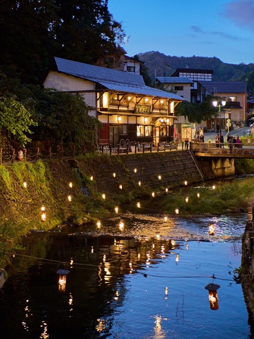
 Ginzan Onsen
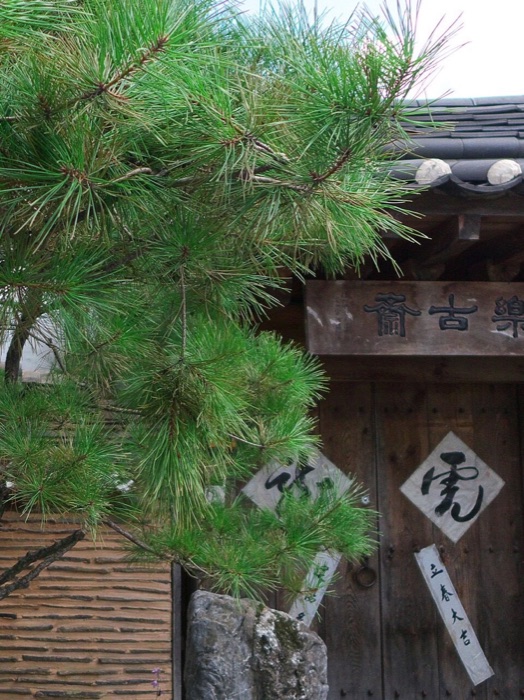 Rakkojae Seoul
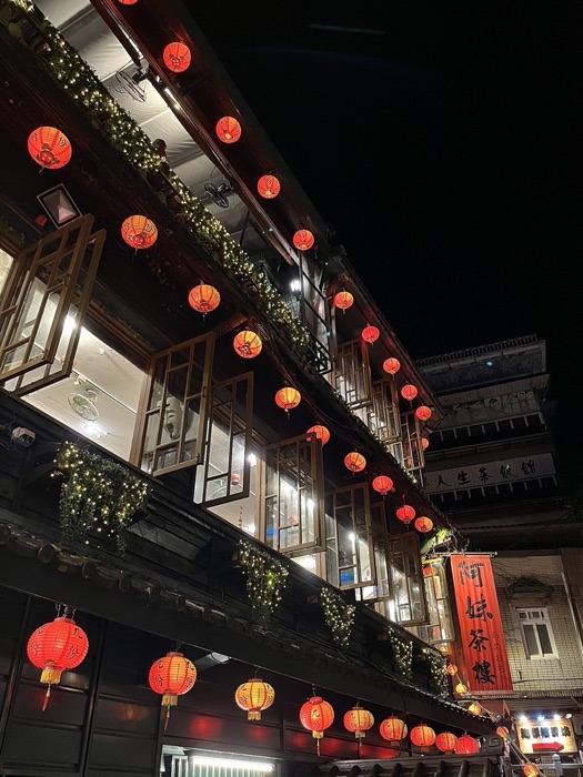 A-Mei Tea House
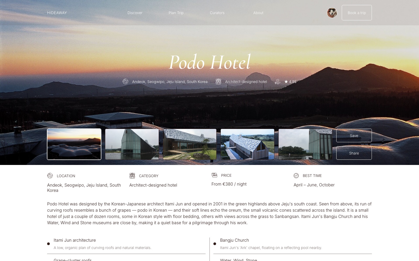
01
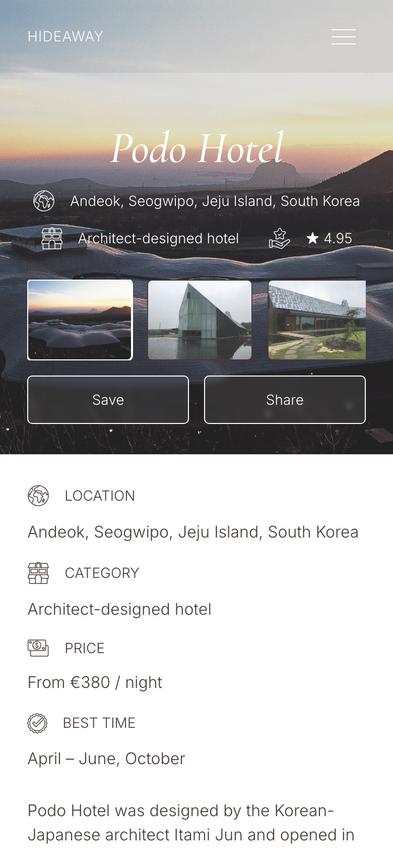
Place page
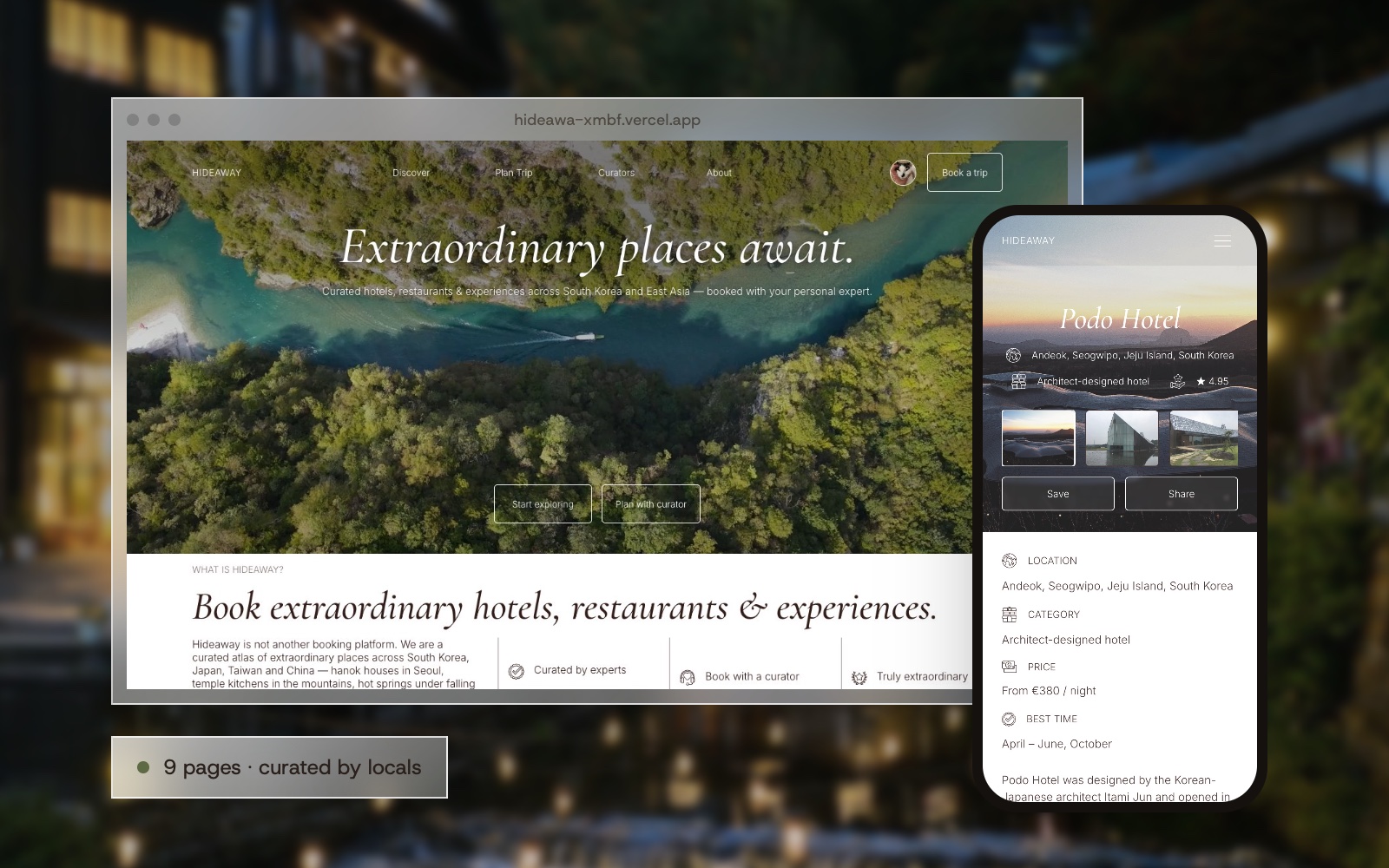
A gallery, the facts people look for first (location, type, price, best time to go) and a story written by the curator.
Travel web design · Front-end · 2026
A curated travel site for South Korea, Japan, Taiwan and China. Instead of thousands of listings, a short atlas of remarkable places, each visited in person by one of four local curators.
Big booking sites show every hotel in a city, ranked by an algorithm and buried in reviews. People who want something special spend weeks looking for the few places that are worth the trip.
Hideaway works the other way round. It is a small atlas of hotels, restaurants and experiences in East Asia, and every place has a person behind it: one of four curators who lives in that country and has been there. Visitors don't search a database, they read a recommendation.
I wanted it to feel like a travel magazine you can book from. Large photography carries the mood, an italic serif sets the headlines, and a quiet palette of deep brown and warm beige lets the places speak.
Seo-yeon Park, Yuki Tanaka, Mei-lin Chen and Wei Zhang each cover one country. Their faces appear on every place they picked.
Sleep, Eat & Drink, Feel, Explore and Wonder. People choose how they want a trip to feel, then filter by country.
A four-step planner ends with a first itinerary from the curator, instead of a booking form.
Every place and photo is real, taken from Wikimedia Commons under free licences and credited on its own page.
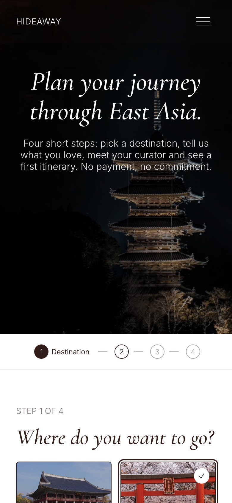
The planner turns a vague wish into a first itinerary in four short steps.
Pick one of four countries and the travel dates.
Slow and calm, food-led, nature or culture, with the number of guests.
Meet the curator for that country: trips planned, rating, regions and languages.
A day-by-day plan with places from the atlas, ready to adjust together.
A magazine palette: deep cocoa for the nav and footer, warm paper for the pages, white cards for places.
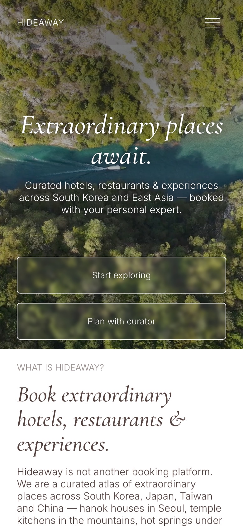
Extraordinary places await.
Every place personally visited by one of our four curators.
The pages a traveller moves through, from finding a place to planning the trip.
A gallery, the facts people look for first (location, type, price, best time to go) and a story written by the curator.
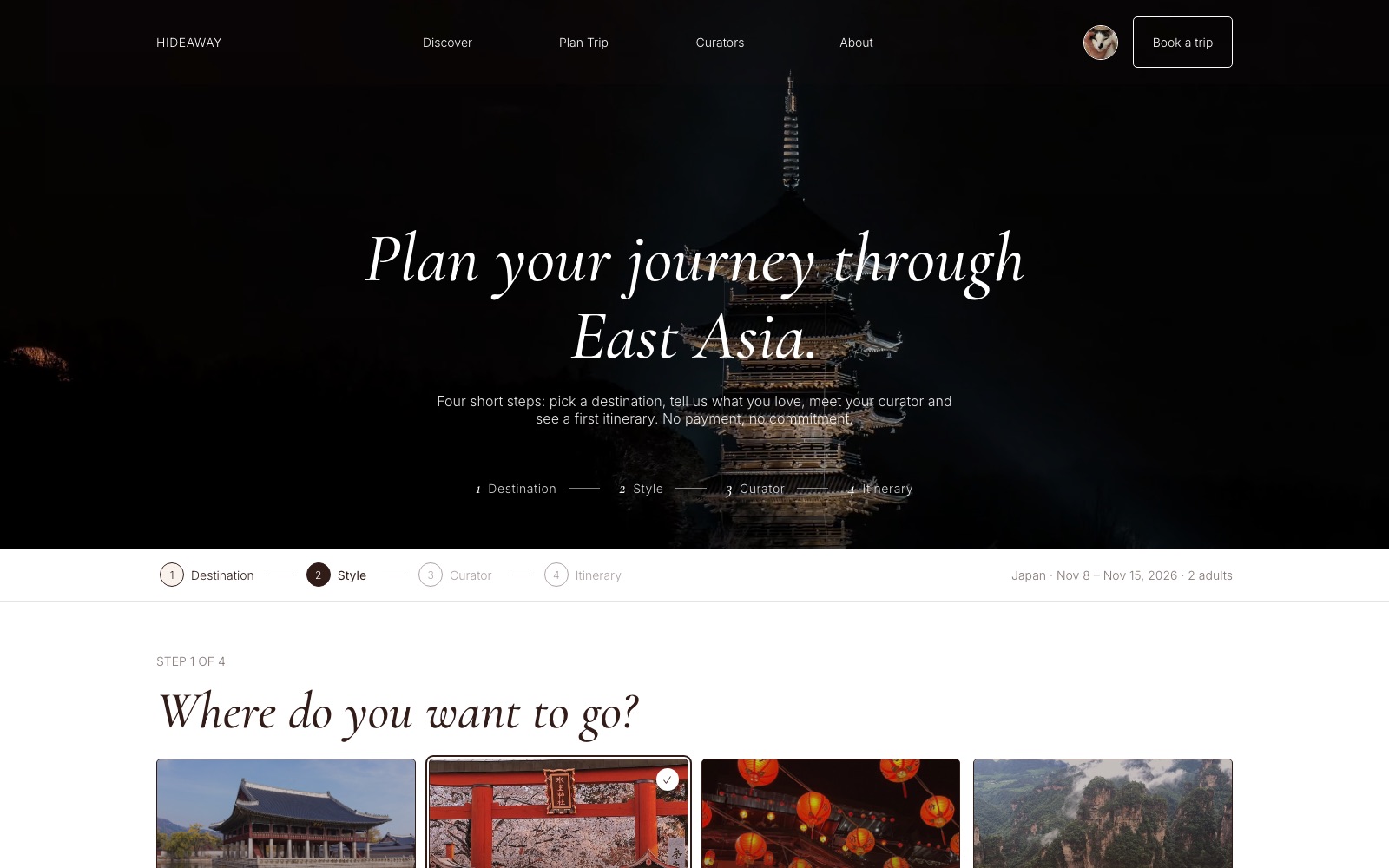
Four steps with a progress bar that keeps the chosen country, dates and guests in view.
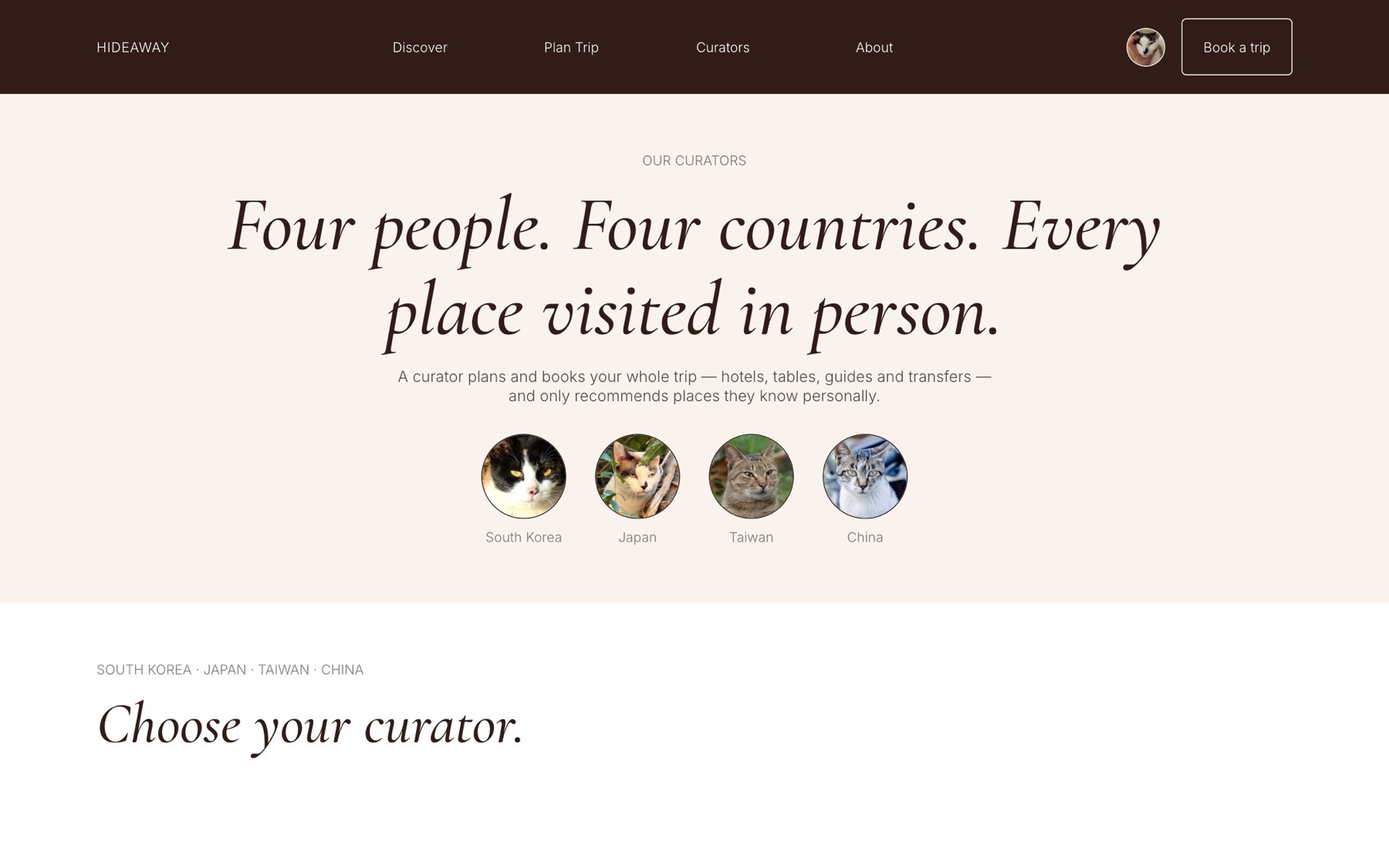
“Four people. Four countries. Every place visited in person.” Each portrait opens that curator's profile.
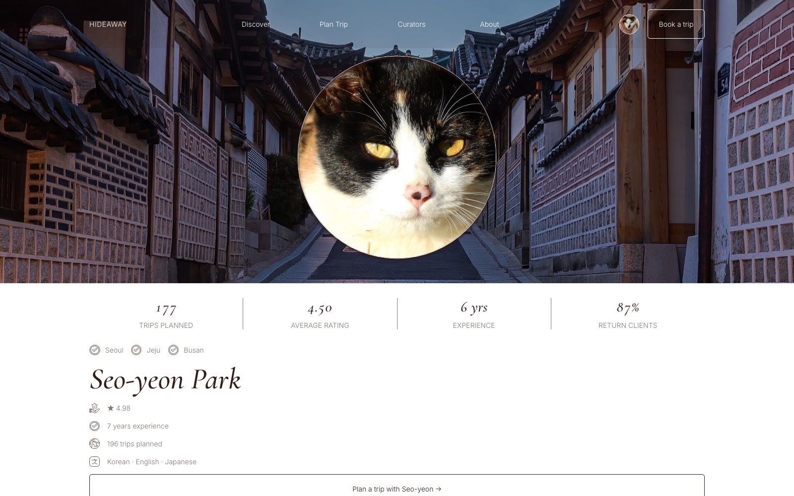
Trips planned, rating, regions and languages build trust in the person. One button starts a trip with them.
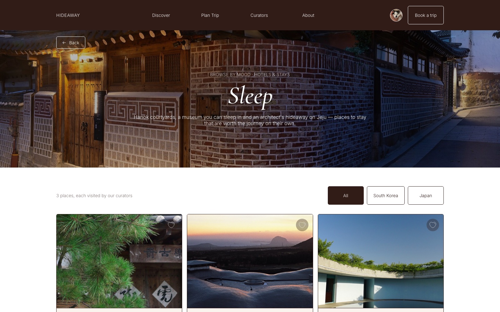
Places grouped by how they feel, with a country filter and price per night.
The home page and the quieter pages that make it feel like a real service.
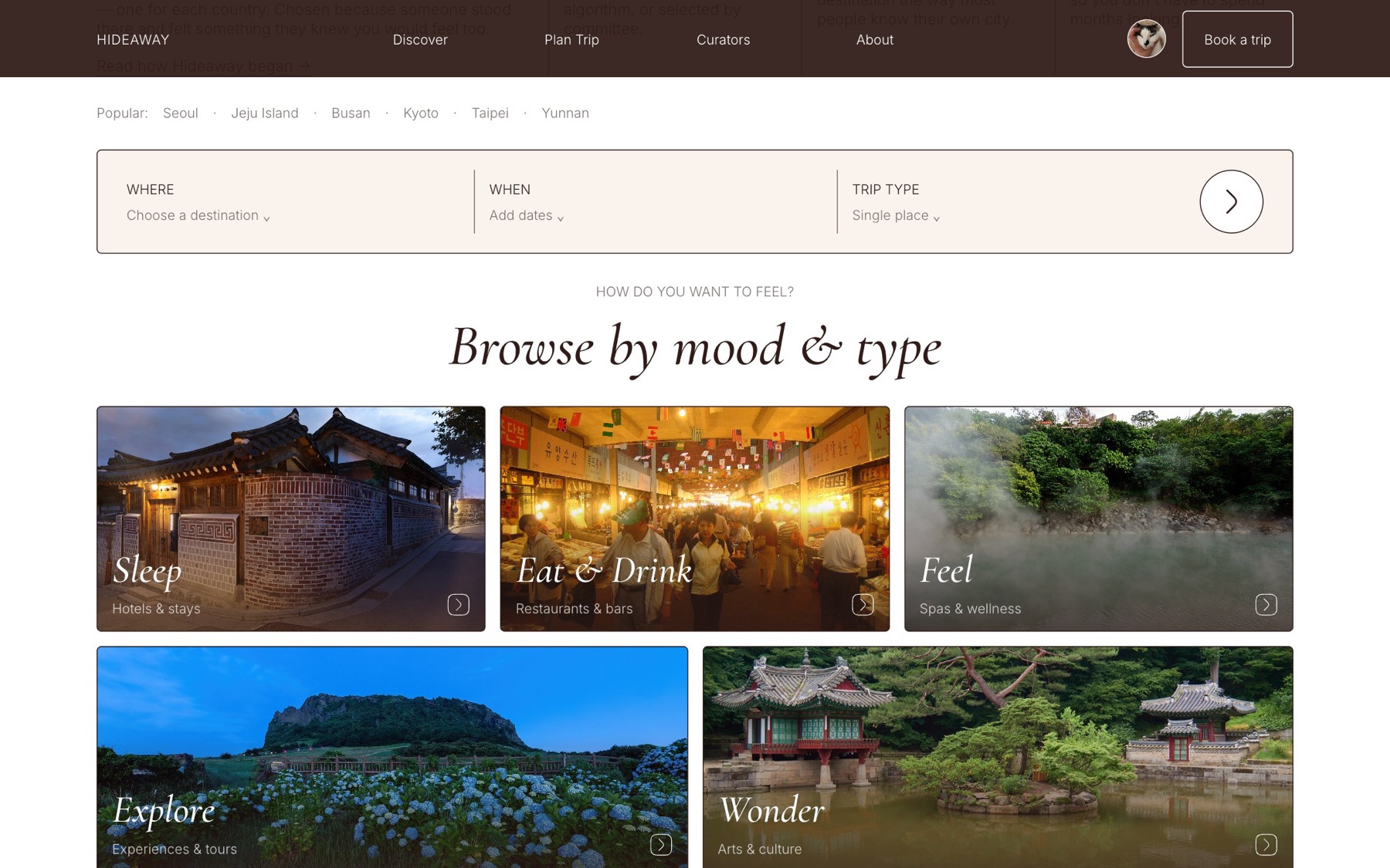
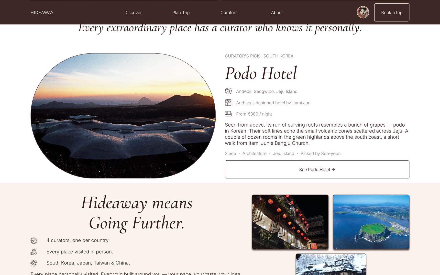
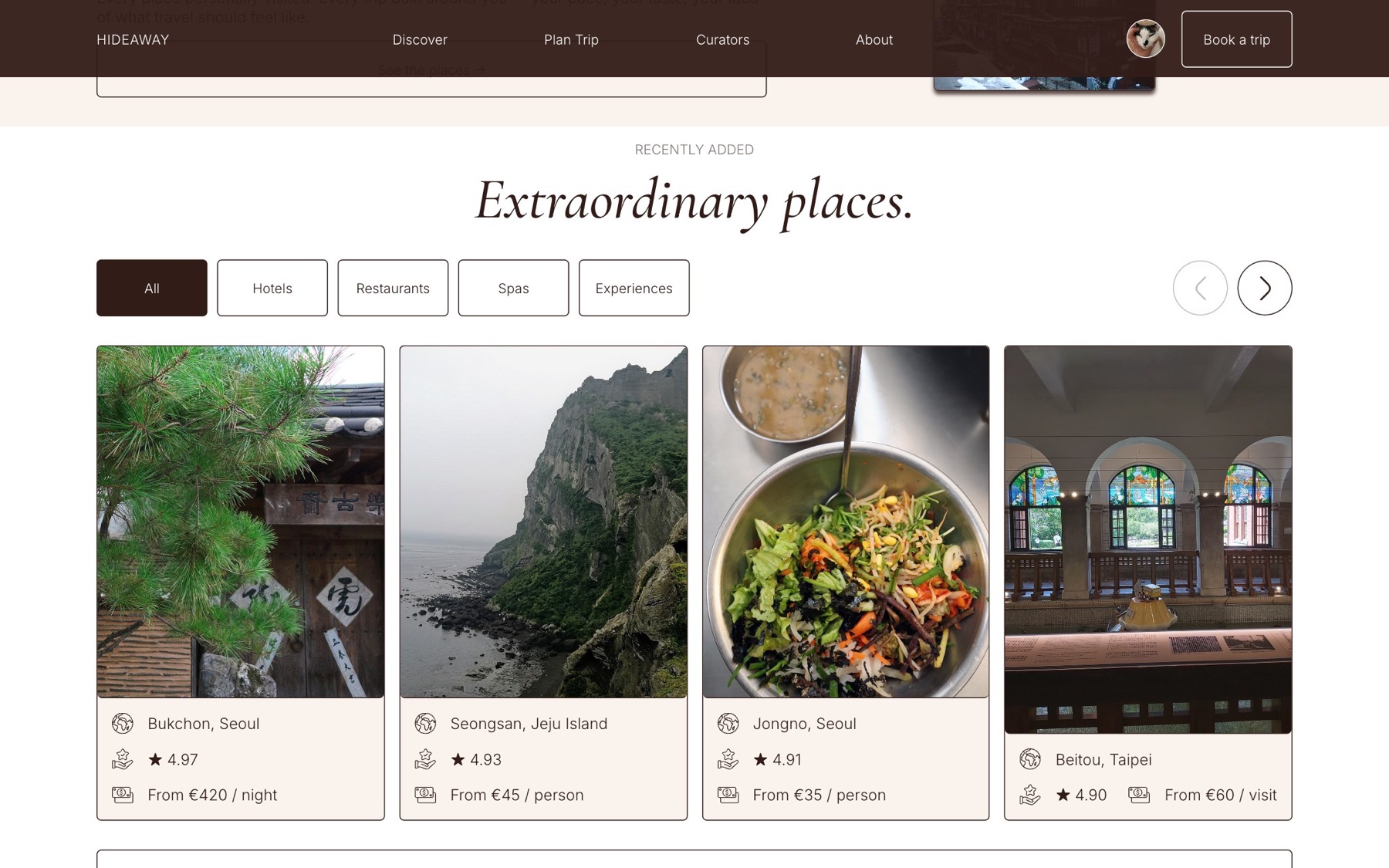
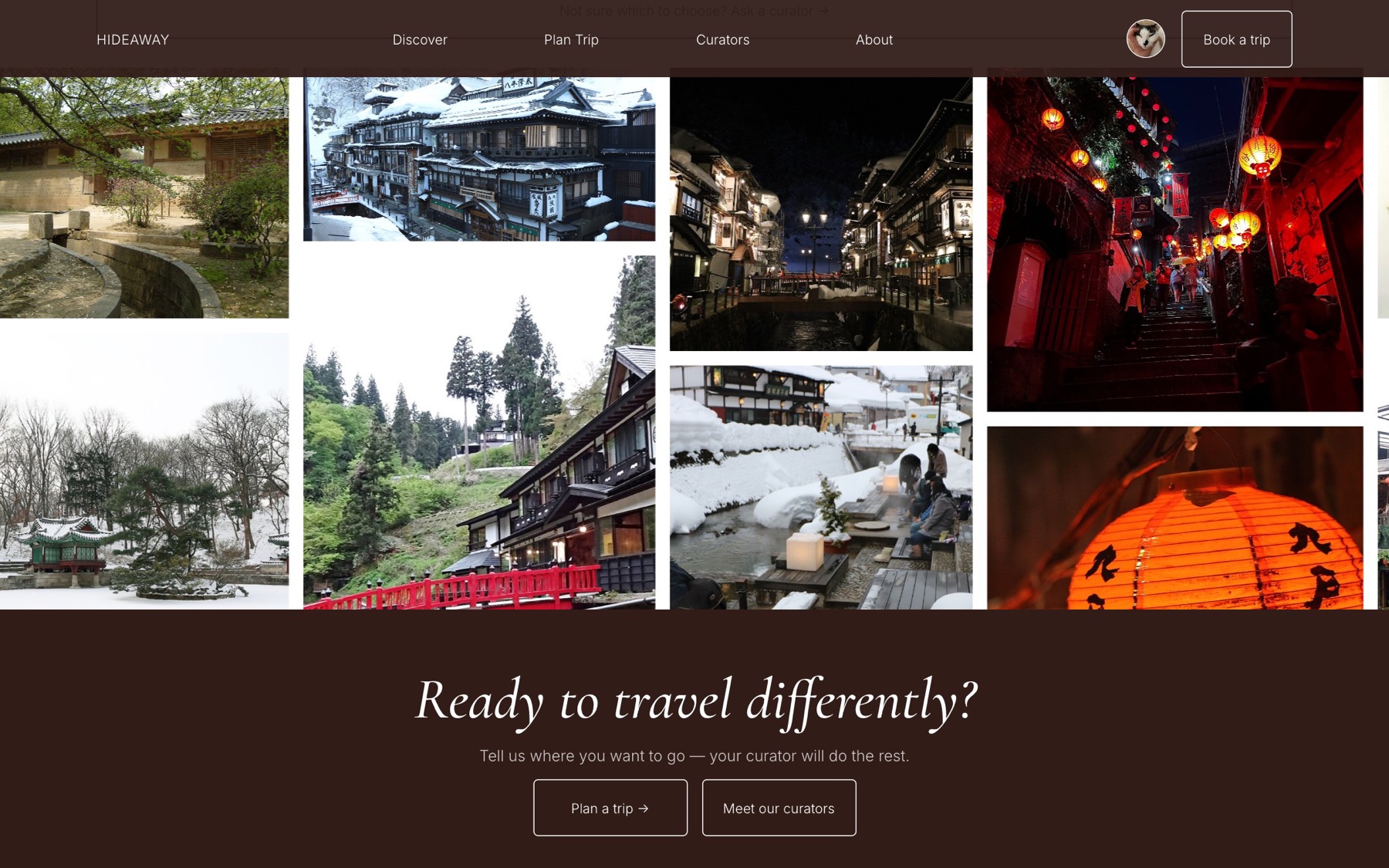
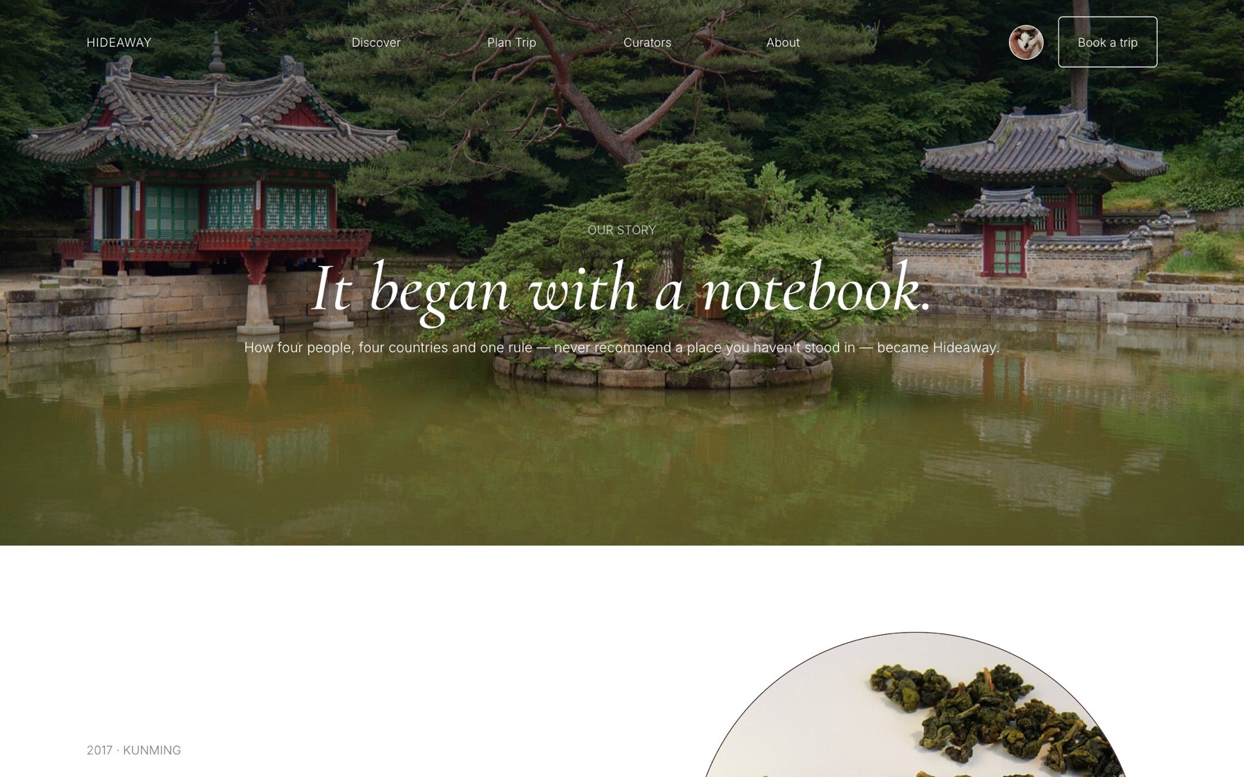
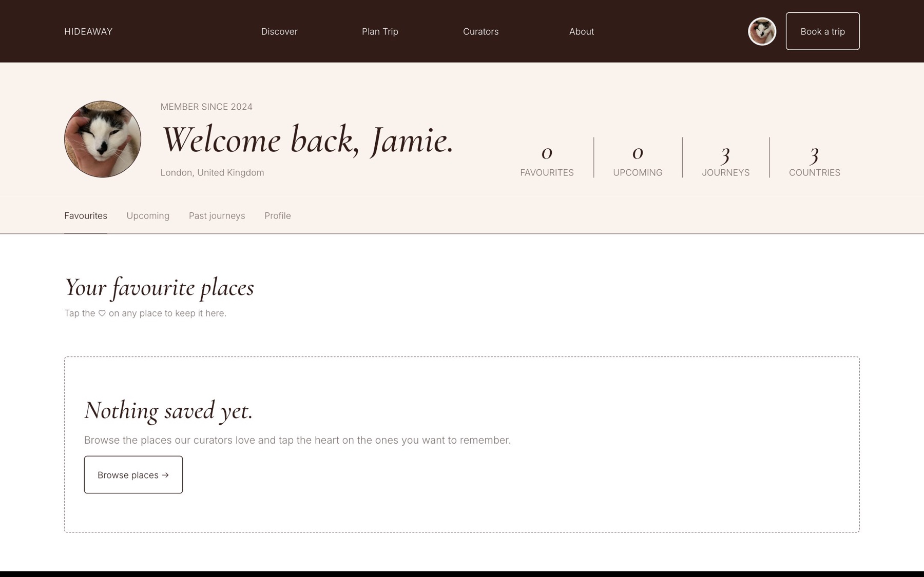
Every page adapts to small screens. The menu collapses, galleries scroll sideways and buttons grow to a comfortable size.
The parts that took the most thought.
Five moods and a country filter make 20+ places feel like a full atlas, and every empty state suggests where to go next.
Each place carries its curator's face and words, and each curator has a profile with their trips and languages.
All photos are real places under free licences, credited on a dedicated page, so nothing looks like a stock template.
See it liveOpen hideawa-xmbf.vercel.app ↗Browse the places, meet the curators and plan a trip in four steps.
Have a project in mind?
Tell me about it in a few lines. I usually reply within a day.