01
Home
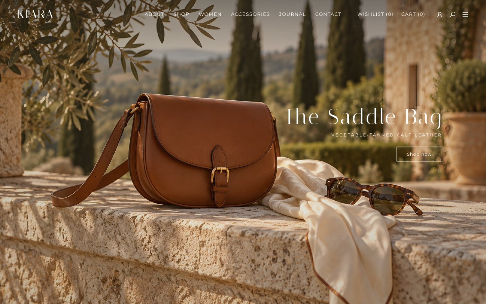
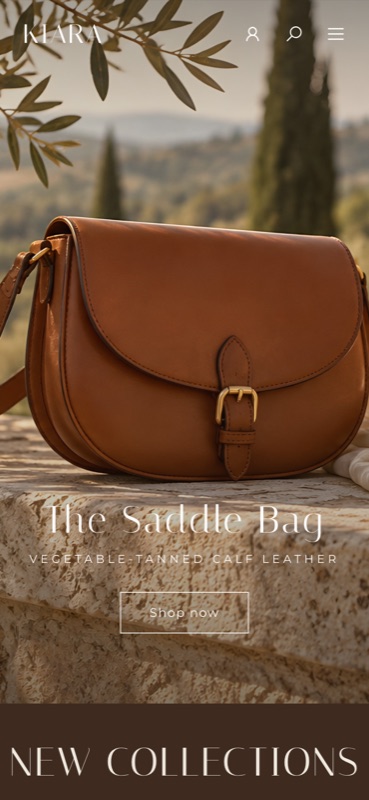
One product, one scene: the saddle bag on a sunlit wall.
Fashion e-commerce · Art direction · 2026
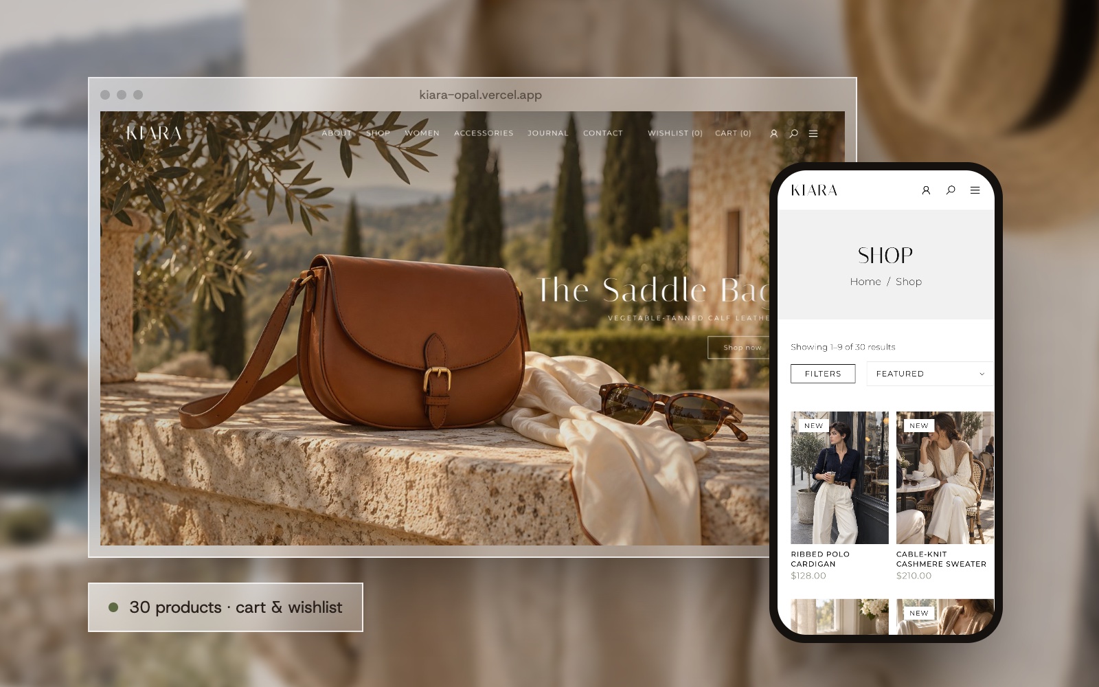
A working storefront for a fictional old-money label: natural fibres, warm neutrals and slow mornings. 30 products, filters, search, quick view, cart and wishlist.
 New
Kiara is a label for unhurried hours: linen, cashmere and leather in camel, ivory and chocolate. Clothes you keep for decades, sold without a single “SALE” banner.
I wanted a shop that reads like a printed lookbook but works like a real store. Under the calm surface there are 30 pieces with filters by category, type, size, colour, price and collection, a search, a quick view, a cart and a wishlist that remember you.
All the photography was generated in one candid, 35 mm documentary style, so the whole store looks like one long shoot on the Mediterranean.
Big sunlit scenes, a thin display serif with wide spacing and lots of white, like a printed catalogue.
Filters, sorting, search, quick view with a gallery, colour and size, a cart and a wishlist saved in the browser.
Every filtered view lives in the address, so “ivory linen under $150” can be sent as a link.
Product names, descriptions and journal stories are written for Kiara, so every page reads finished.
How a visitor moves from the mood to a piece in the cart.
The home page opens on one product in one sunlit place.
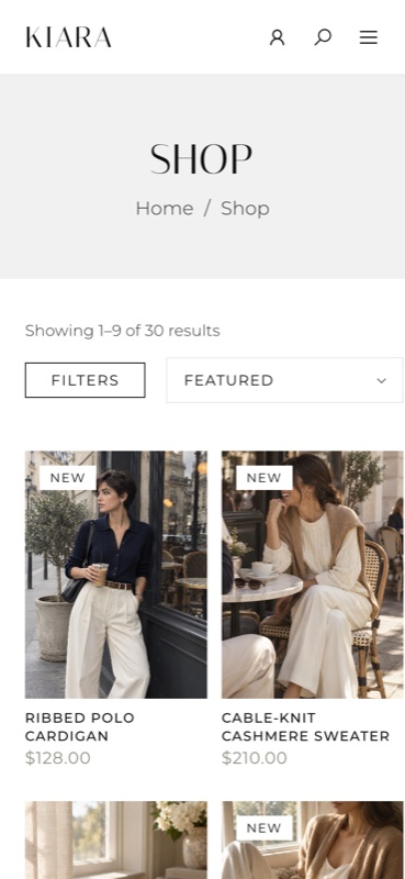
Filters by category, type, size, colour, price and collection.
A lifestyle photo and a packshot, colour, size and quantity without leaving the grid.
Saved in the browser, so they are still there tomorrow.
Warm stone and paper, with chocolate and sage as the only accents.
KIARA
CABLE-KNIT CASHMERE SWEATER — $210
The art of slow mornings
The store from the first look to the product grid and the brand story.
One product, one scene: the saddle bag on a sunlit wall.
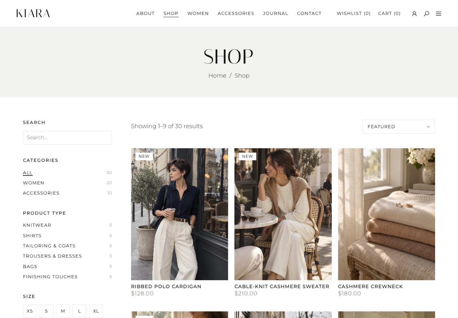
A filter column and a grid that updates instantly, with sorting and Load more.
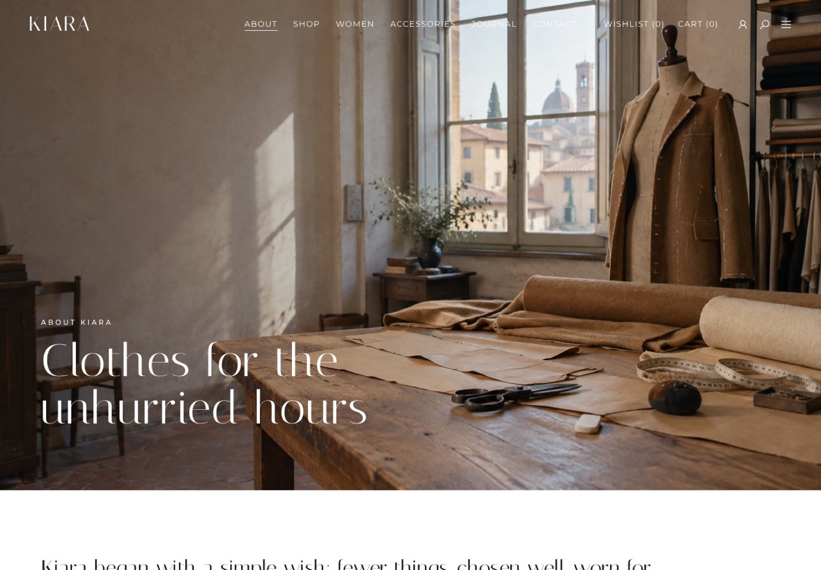
“Clothes for the unhurried hours”: the atelier story over a sunlit workshop.
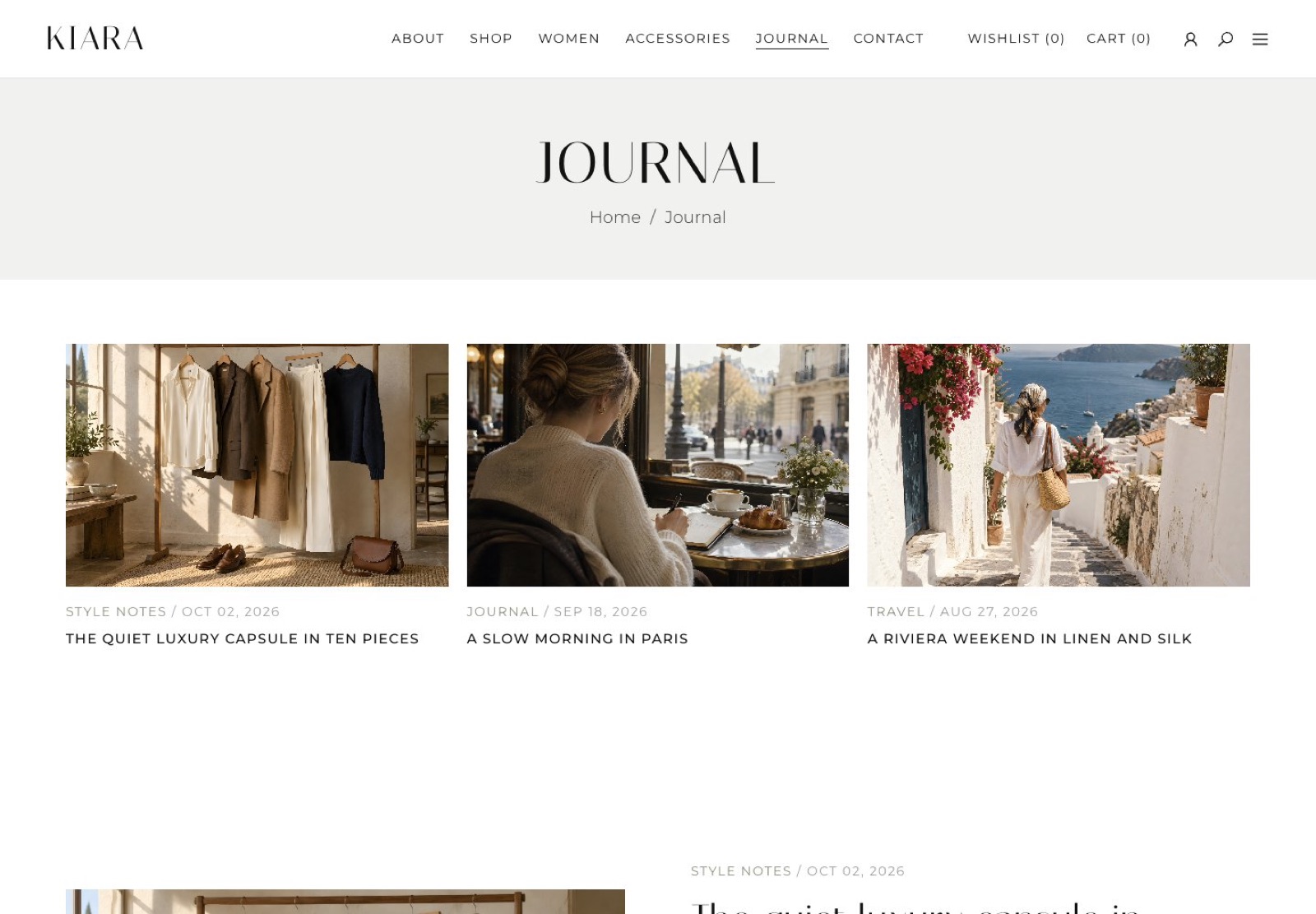
Style notes and travel stories that keep the brand alive between collections.
Everything a real shop needs, dressed in the same calm lookbook style.
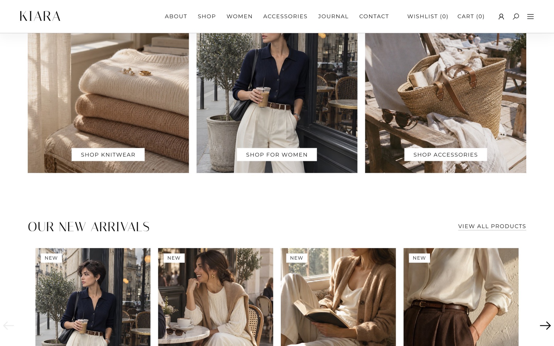
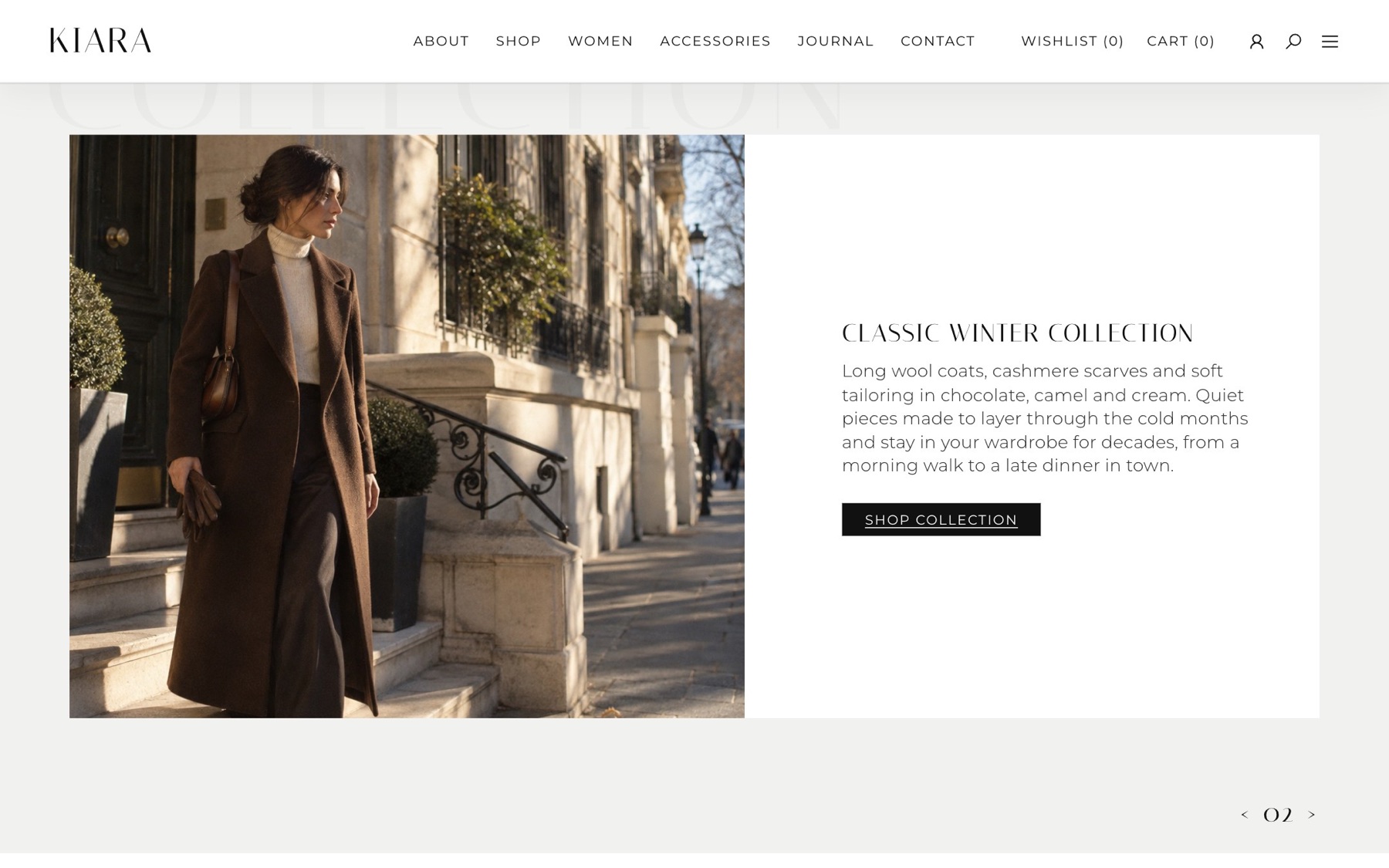
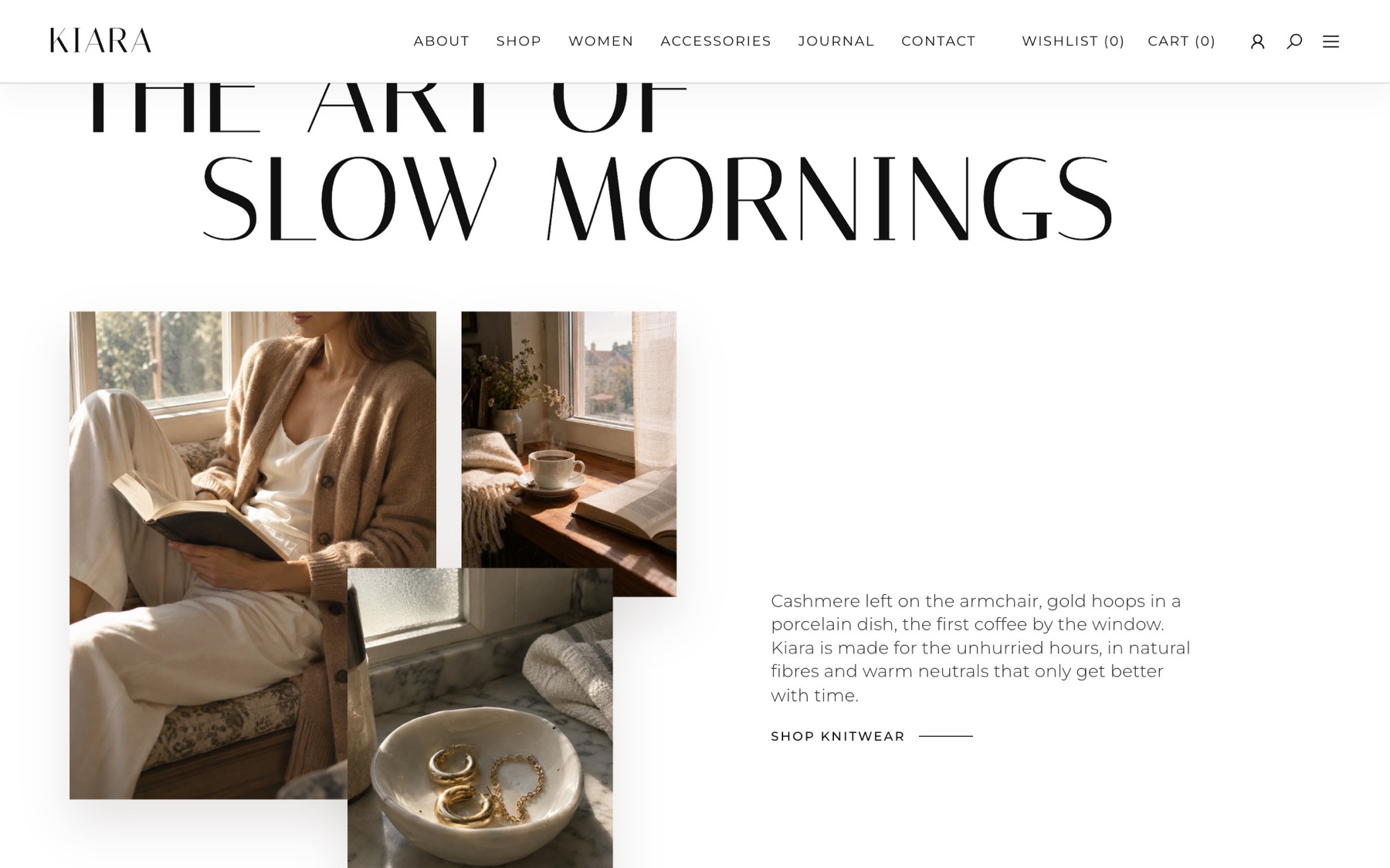
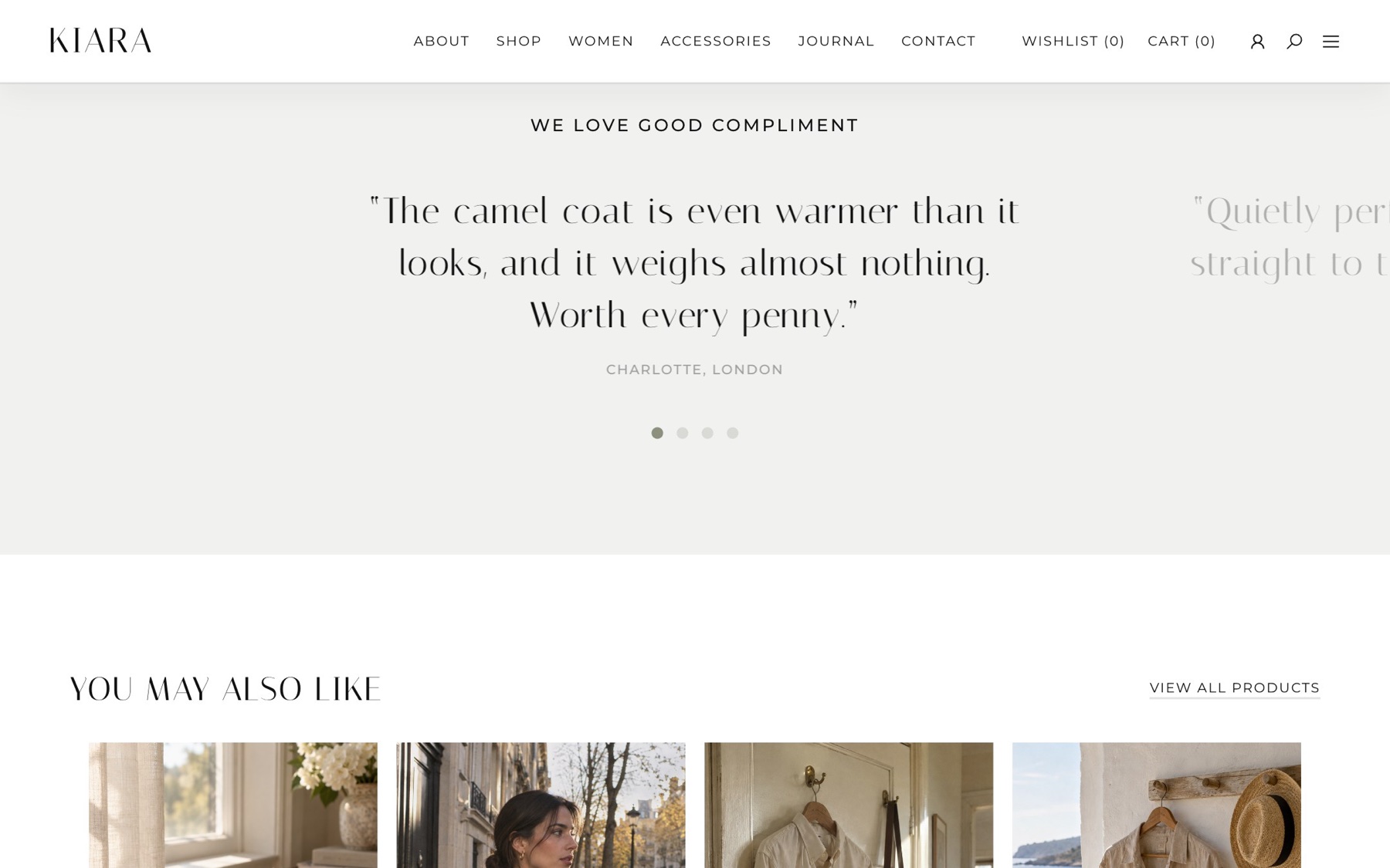
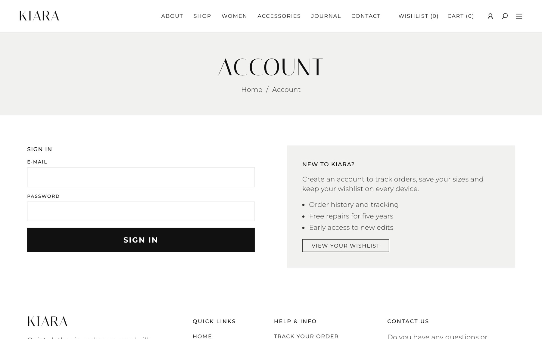
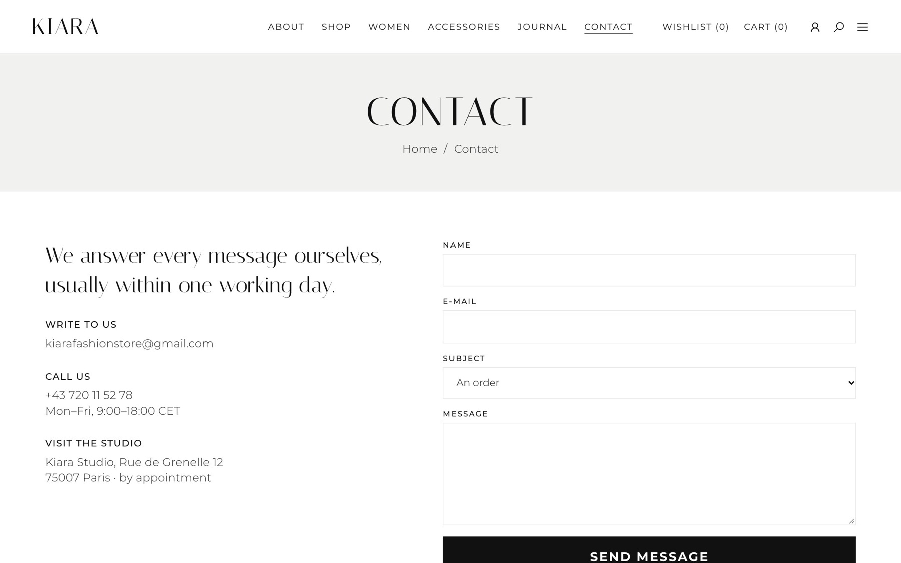
The menu folds into one button, the filters slide in from the side and the cart stays one tap away.
The parts that took the most thought.
Quiet type and space for the photos, but the cart, size and price are never more than one tap away.
All images share one documentary style and palette, so 30 products look like one collection.
Filter state lives in the URL, which also makes the back button work as people expect.
See it liveOpen kiara-opal.vercel.app ↗Filter the 30 pieces, open a quick view, add to the bag and the wishlist.
Have a project in mind?
Tell me about it in a few lines. I usually reply within a day.