01
Landing
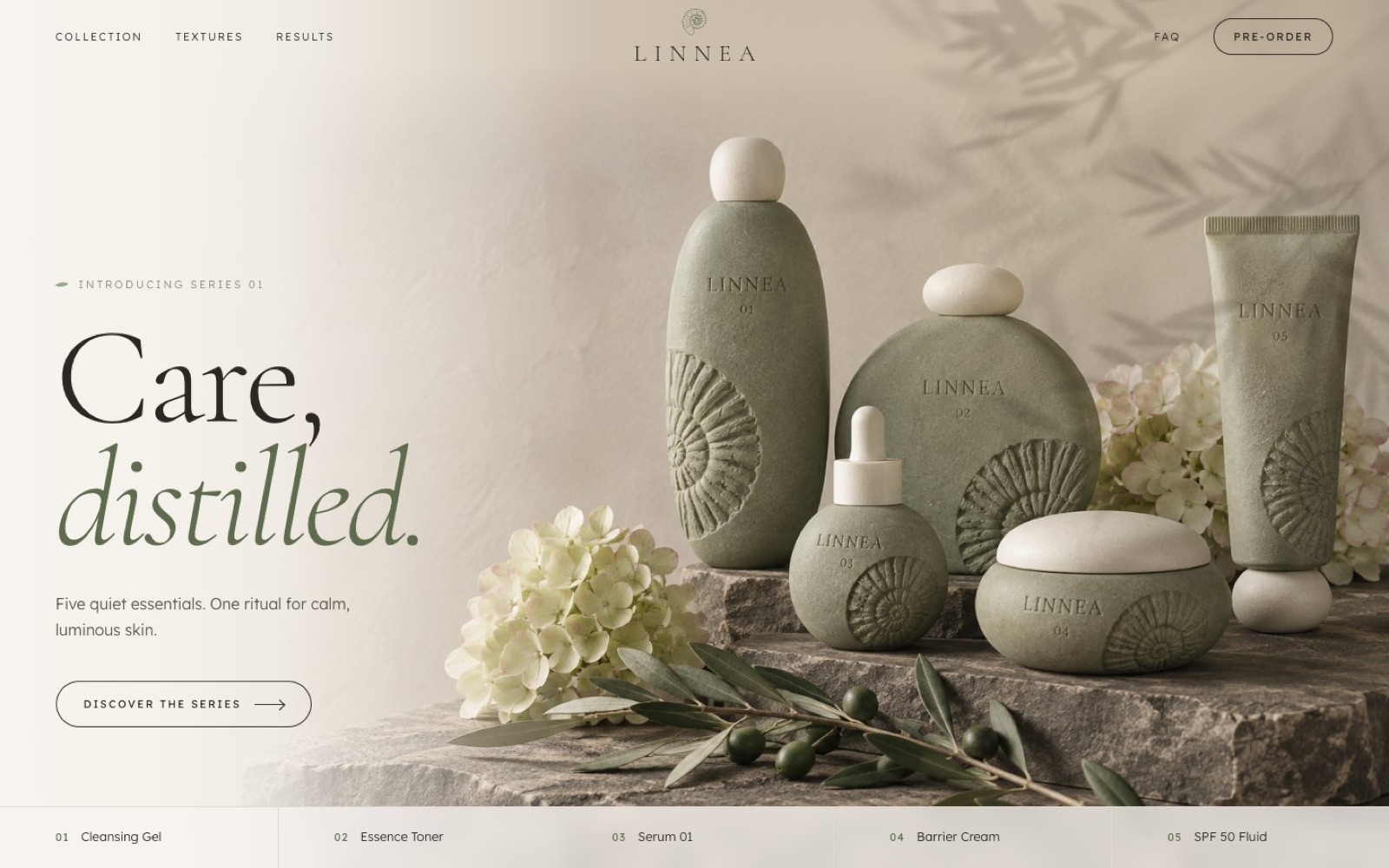
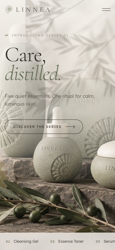
“Care, distilled.” next to the whole series, with a leaf shadow drifting over the page.
Skincare promo · Packaging · 3D · 2026
A concept launch for a quiet skincare series: five essentials, one ritual. Stone, sand and sage set the mood, and the packaging is a family of sculptural pebbles with a carved ammonite.
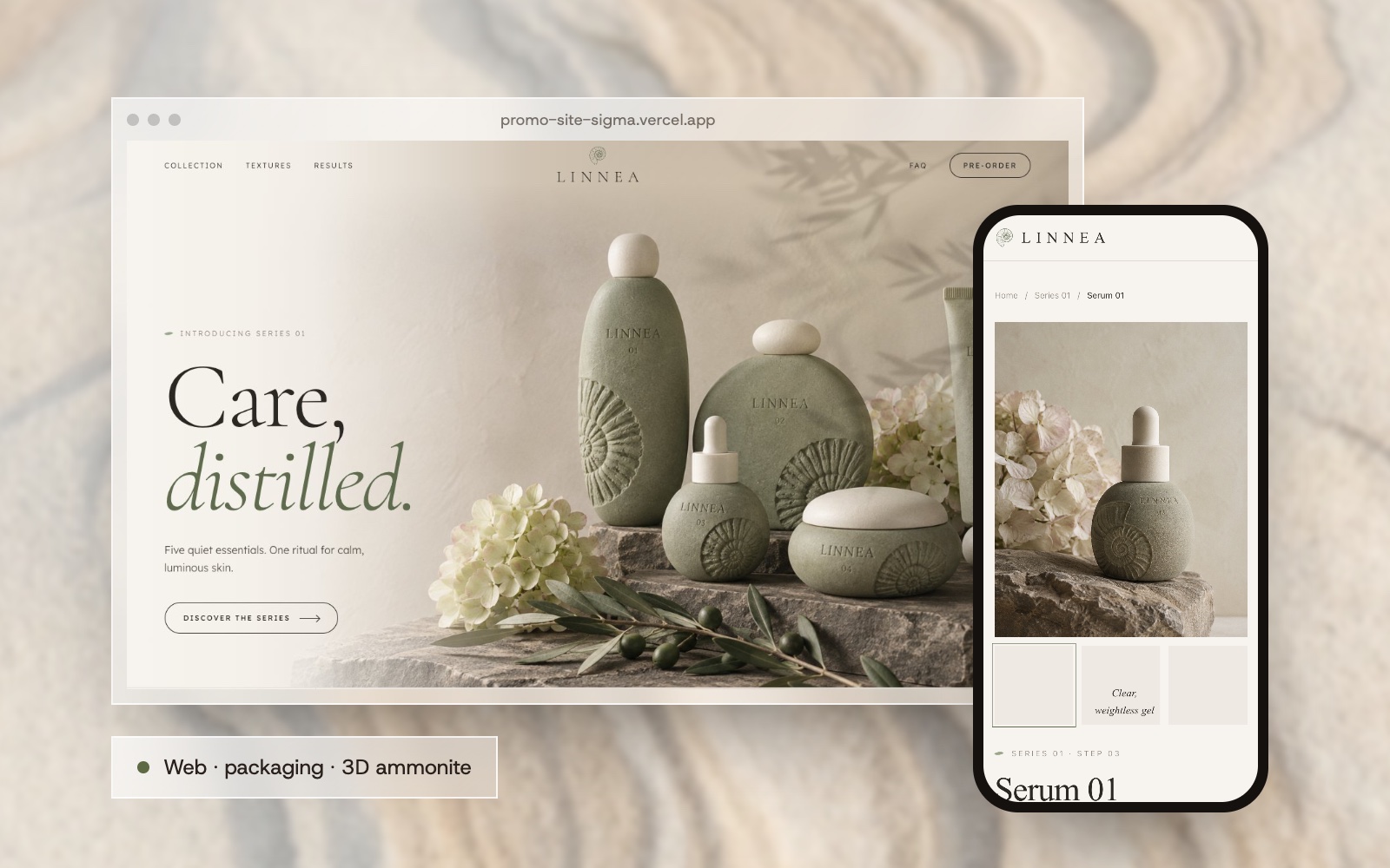
Linnea is named after the twinflower of northern forests, and after the botanist Carl Linnaeus. The brief I set myself: a skincare launch that feels like a walk on a Scandinavian coast, with nothing loud in it.
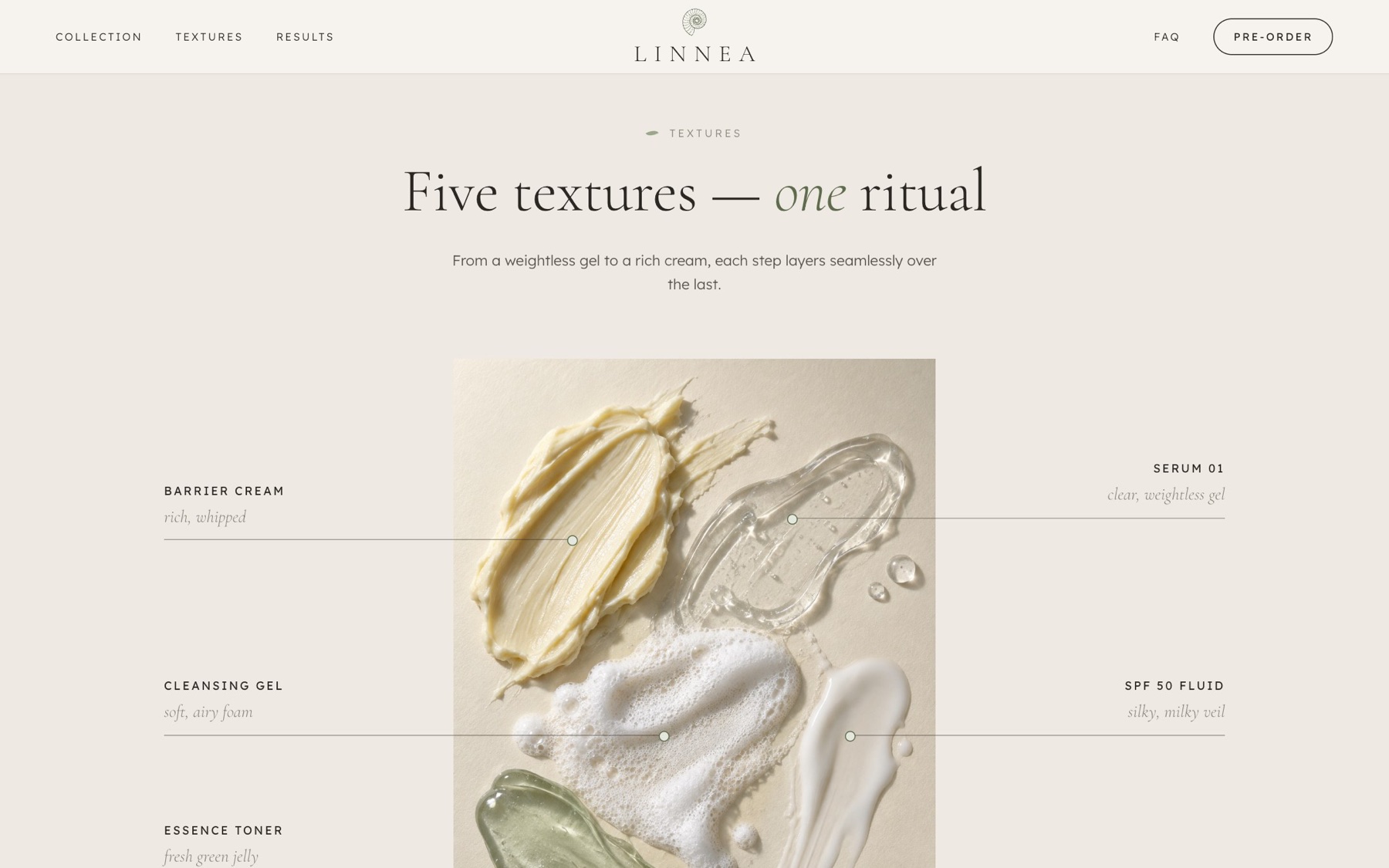
The series is five essentials used as one daily ritual: a cleansing gel, an essence toner, Serum 01, a barrier cream and an SPF 50 fluid. Each one has its own texture, and the site lets you see and almost touch them.
The packaging grew from one object, an ammonite fossil. Every bottle is a smooth pebble with the fossil carved into it, and the same fossil, a real 3D scan, turns slowly on the landing page.
Five products in a fixed order, so the brand sells a habit, not a shelf.
Pebble bottles with a carved ammonite. A separate page compares four directions on the whole series.
A photogrammetry scan of a real ammonite, simplified to about 40 thousand polygons, rotating in three.js.
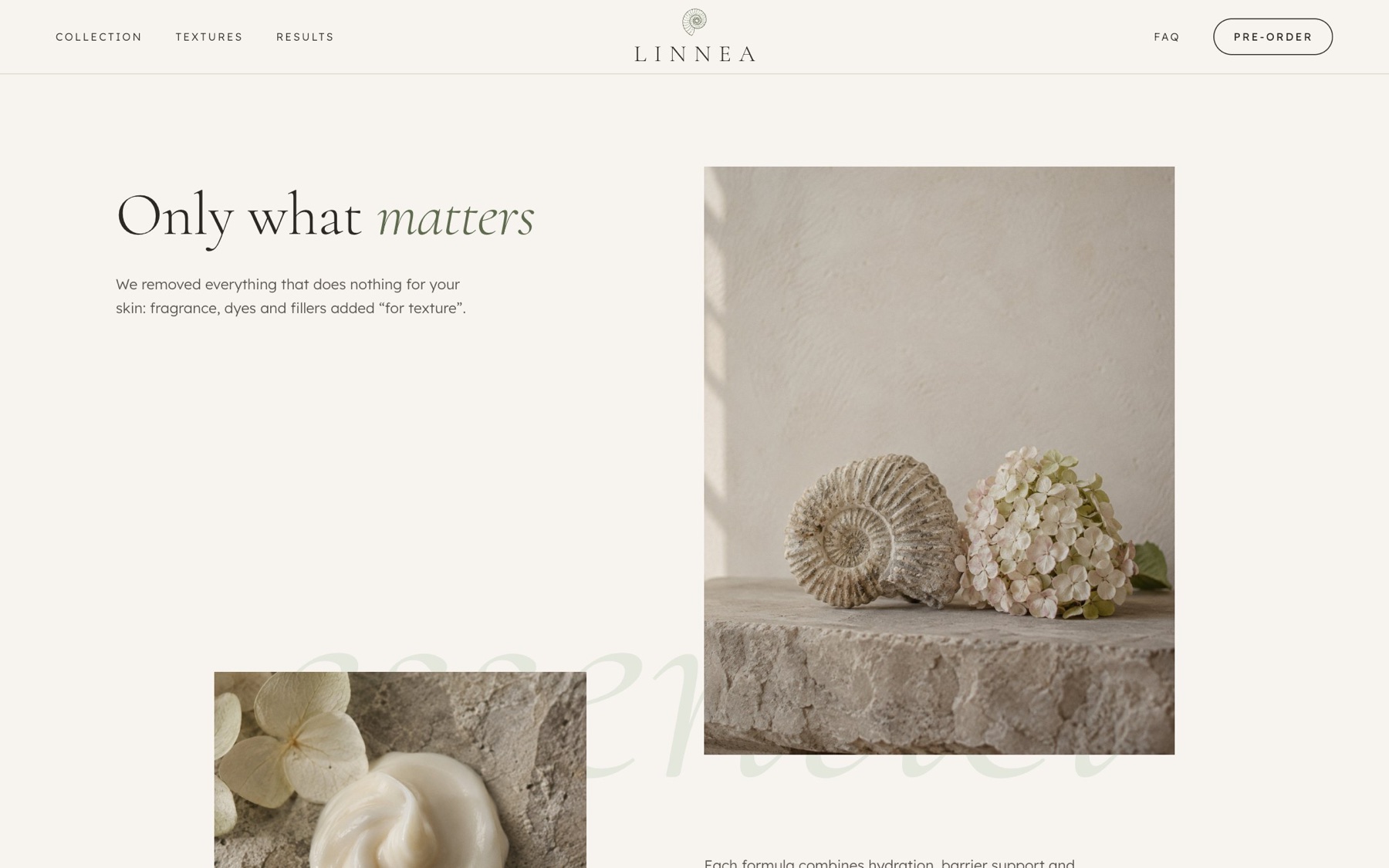
Long sections with room to breathe: philosophy, the series, textures, results, mood and a pre-order.
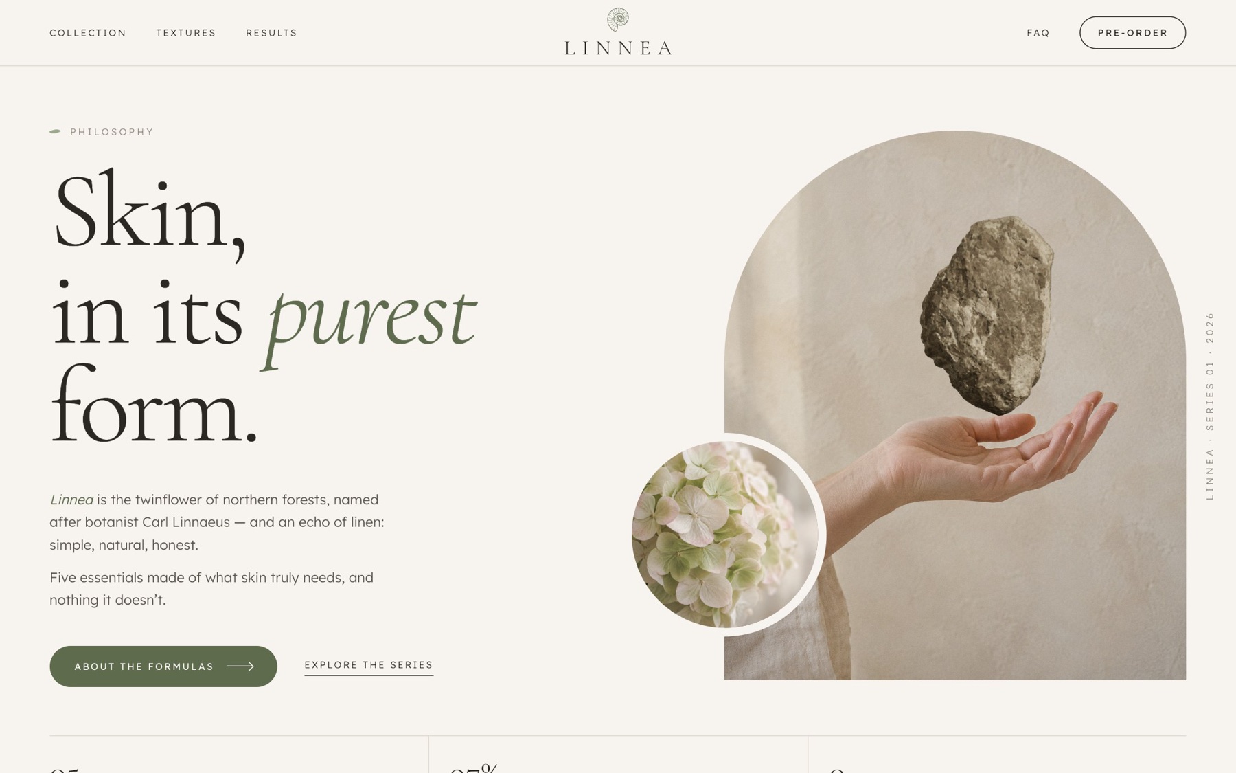
The landing page is read top to bottom like a short story.
The whole series on a stone ledge, with the five products named along the bottom.
Skin in its purest form: the fossil, the stone and three numbers.
Every product as a swatch on one sheet, from weightless gel to rich cream.
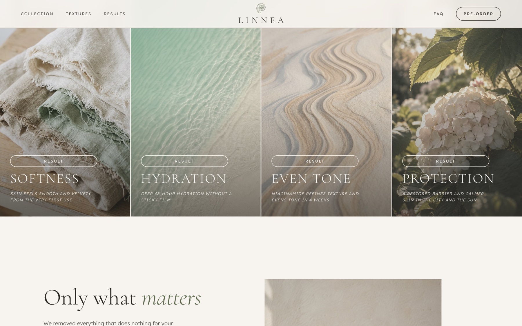
Results, mood, a short FAQ and a quiet sign-up for the first batch.
Cream, sand and stone with sage accents, the colours of the coast the brand is named after.
Care, distilled.
Five quiet essentials. One ritual for calm, luminous skin.
From the first impression to choosing a product and its packaging.
“Care, distilled.” next to the whole series, with a leaf shadow drifting over the page.
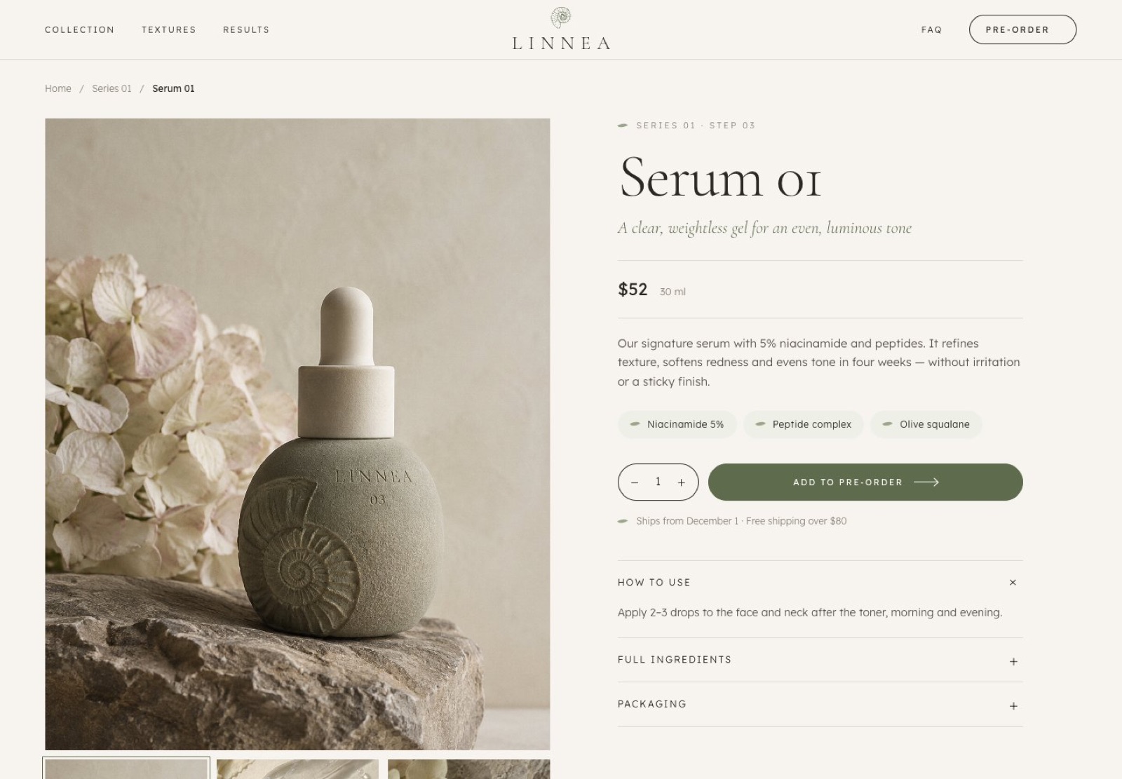
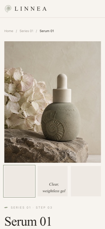
Large photo, price, three key ingredients and a pre-order button; how to use, ingredients and packaging fold below.
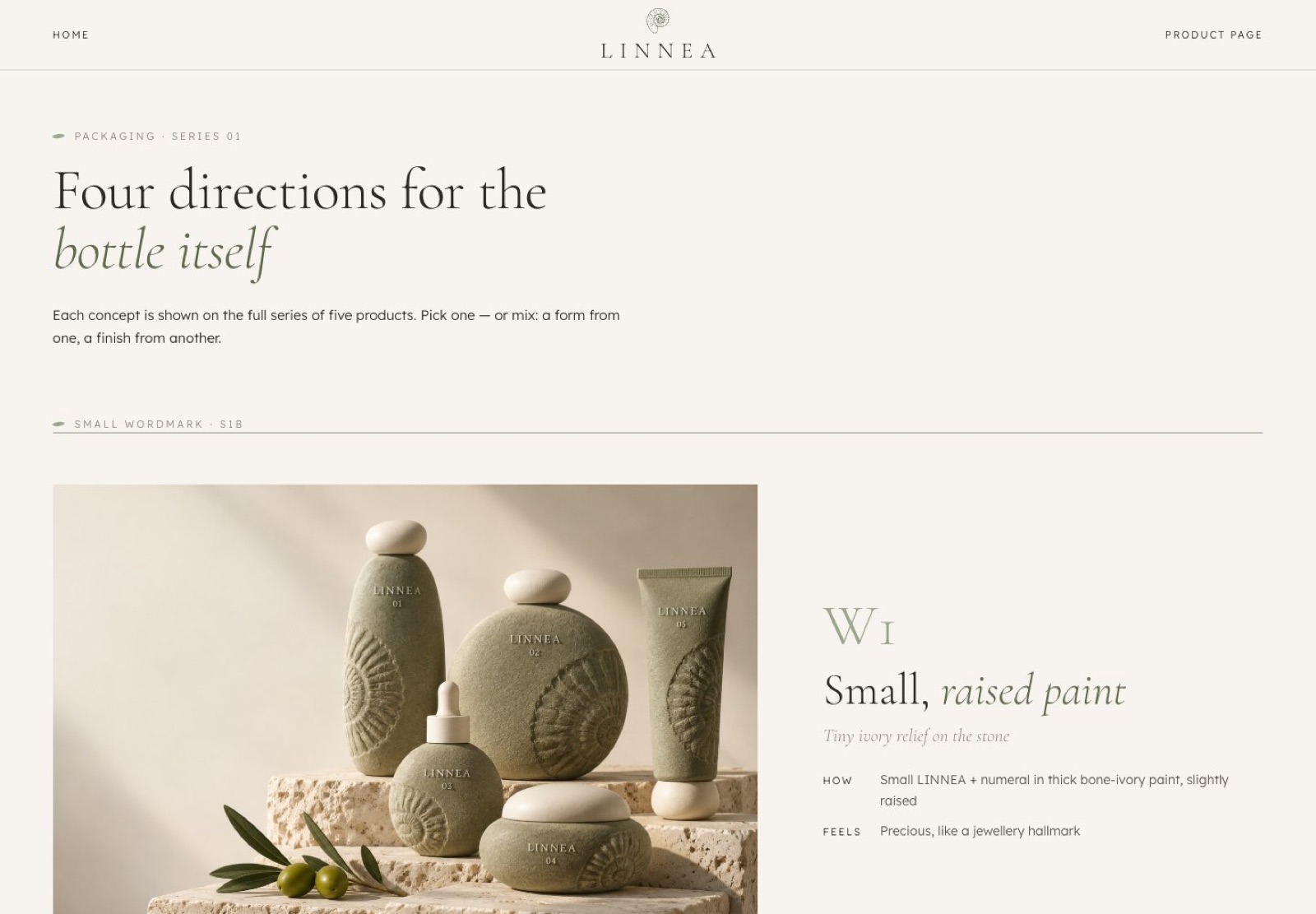
Four directions for the bottle, from a small raised wordmark to a full carved relief.
Each section has its own entrance: photos open like curtains, the fossil turns as you scroll and texture swatches spread across the page.
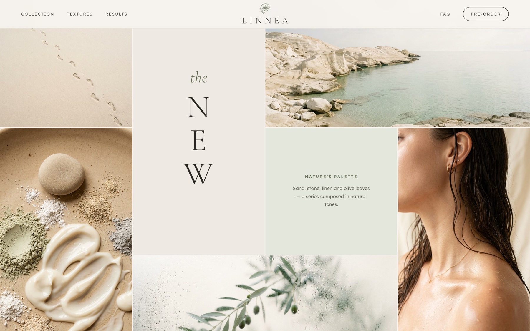
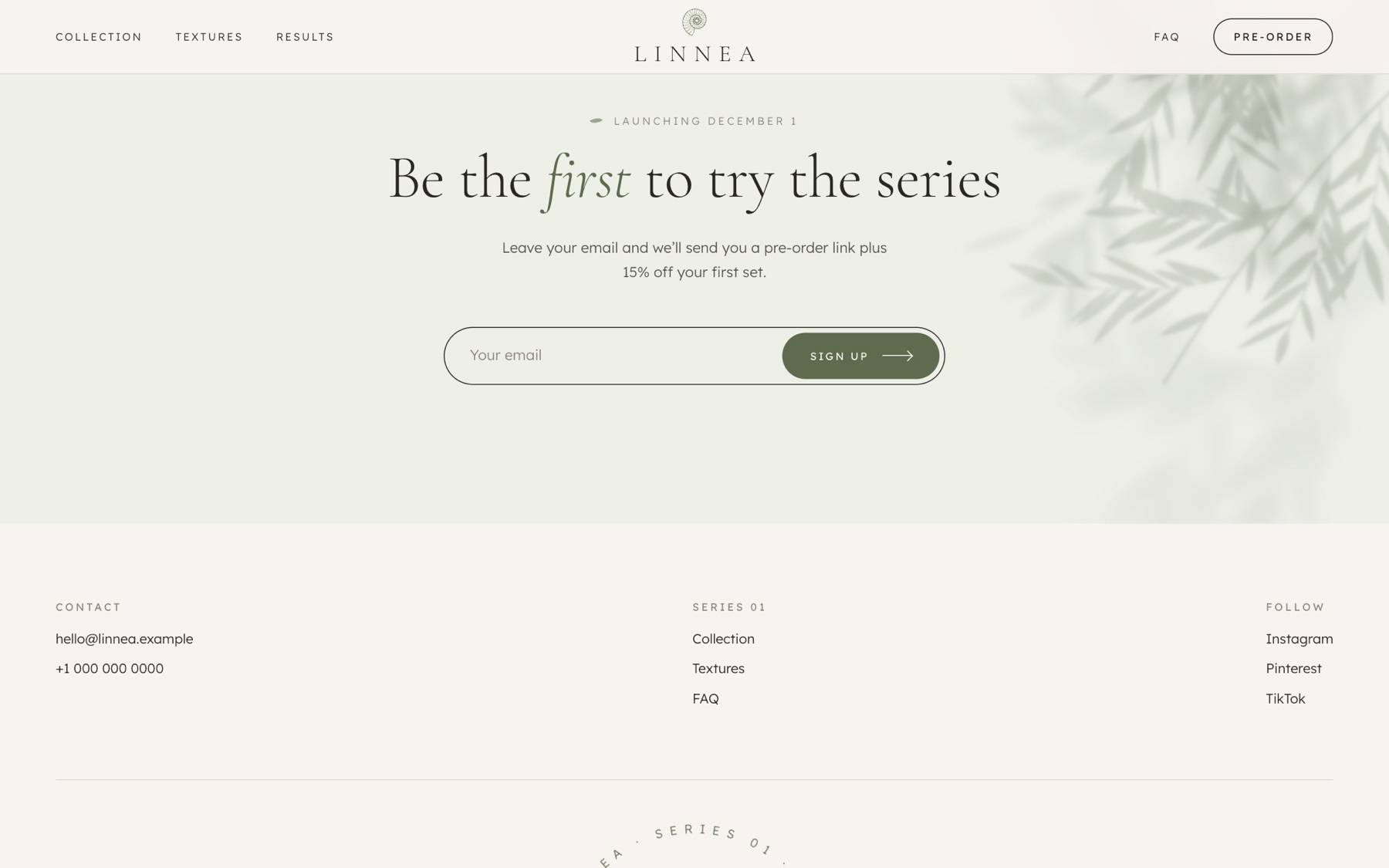
On a phone the series becomes a swipeable row, and the pre-order button stays within thumb reach.
The parts that took the most thought.
The scan is reduced to about 40 thousand polygons, the texture loads separately and phones get a smaller one.
Each product has its own shape, but the same stone colour, mark and fossil keep them a set.
Four directions are shown side by side on the real series, so the choice is visible, not hidden in a file.
See it liveOpen promo-site-sigma.vercel.app ↗Turn the 3D ammonite, open the five products and compare the packaging directions.
Have a project in mind?
Tell me about it in a few lines. I usually reply within a day.